June 26 2025
2025 Alfa Romeo Stelvio Intensa | Rosso GTA - Pictures
Discover one of our first images of the Alfa Romeo Stelvio Intensa 2025 in Rosso GTA color. Stock: AR2549
August 18 2022, Scotti Alfa Romeo

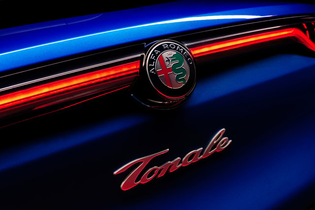
Car manufacturers all have logos that speak volumes about their history. Some are more common than others, however, but this is not the case with the Alfa Romeo logo that can be found on the brand's vehicles.
In fact, it speaks volumes and tells us interesting things about the history of the company, as well as its evolution. The Alfa Romeo brand was officially founded on June 24, 1910, and since then it has chosen a logo that is very similar to the one used today. Thus, it is a century-old symbol that we admire.
So, how do we explain the presence of a man-eating snake and the meaning of the Alfa Romeo symbol?

The idea for the logo came from the designer Romano Cattaneo while he was in Piazza Castello in the center of Milan. He was simply waiting for his streetcar, number 14. On the wall of the Filarete tower were several heraldic interpretations of the Biscione Visconteo, the coat of arms of the city of Milan, as well as of the Visconti family that ruled it in medieval times.
In Italian, Biscione basically means "big grass snake". The association of the icon with Milan could come from a bronze snake souvenir brought back from Constantinople by Arnolf II of Arsago, who was archbishop of Milan from 998 to 1018. This image and a representation of the official flag of Milan, a red cross on a white background, are the elements that have defined the nine Alfa logos throughout history.
What is interesting to note is the evolution of the logo over the years.
The first version ran from 1910 to 1915 and others followed until 1945, keeping the same style. From 1946 to 1950, there was a radical change. If the snake and the interpretation of the flag of Milan were still present, a red background came to serve the engraved logos of gold color.
What is fascinating is that to fully understand it, we must refer to the historical context of the end of the Second World War. With the fall of the Italian monarchy, the imperial knots that could be seen in the circumference of the logo were replaced by two wavy lines. But most important in this review was the fact that the bombing had severely damaged the entire Italian industrial base, including the supplier of Alfa's multicolored badges. This greatly simplified design was easier to make gold on red, with its less elaborate gold laurel wreath frame and larger, smoother snake with fewer coils. The person it devours is also placed at an angle. This dramatic change to the Alfa logo was the shortest in history. By 1950, the logo was back to its original form.
Other modifications followed. The most representative of the brand's evolution came in 1972 when the wavy lines disappeared, as well as the name of the city, Milano. The aim was to show that Alfa was now present far beyond Milan's borders.
The current Alfa Romeo logo was redesigned in 2015.
Other Articles That May Interest You
June 26 2025
2025 Alfa Romeo Stelvio Intensa | Rosso GTA - Pictures
Discover one of our first images of the Alfa Romeo Stelvio Intensa 2025 in Rosso GTA color. Stock: AR2549
June 24 2025
Two Well-Considered Powertrains for the 2025 Alfa Romeo Tonale
The 2025 Alfa Romeo Tonale marks a new chapter for the Italian marque, marrying its sporting heritage with state-of-the-art technology. This compact SUV—Alfa Romeo’s first in its segment—is offered in Canada with two distinct powertrains: a plug-in hybrid focused on electrification, and a high-output turbocharged petrol engine. Each caters to different needs, yet both share the same goal:...
June 20 2025
2025 Alfa Romeo Stelvio: A Luxurious, High-Tech Interior
With roots firmly planted in motorsport heritage, the 2025 Alfa Romeo Stelvio continues to showcase the brand’s sporting DNA while delivering the refinement and technology you’d expect from a premium SUV. Its impressive on-road performance is matched by an interior designed around comfort, connectivity and safety—an engaging blend of dynamic character and upscale ambience that sets the Stelvio...